International Diabetes Federation A brand symbolising hope and courage for the worldwide diabetes community
Reimagining the ‘bird of hope’ emblem for the International Diabetes Federation and developing the brand for the future.


The mission of the International Diabetes Federation (IDF) is to improve the lives of people with diabetes and prevent diabetes in those at risk.
The hummingbird emblem used in the IDF visual identity was first adopted as a symbol for diabetes by the Dutch Diabetes Federation. Known as “the bird of hope”, the hummingbird was chosen to represent the optimism of people with diabetes as they find ways to manage their condition, overcome its challenges and deal with its potentially devastating complications.
The hummingbird became the official symbol of the International Diabetes Federation in 1984 and has since represented and united millions of people throughout the world with a message of hope in the fight against diabetes. Optima have worked on a new brand design for IDF which retains this important symbol and positions them as the leading voice in the diabetes community
Blue has become synonymous with diabetes since 2006 when United Nations adopted a blue circle emblem as the international symbol for diabetes. The colour has also become an intrinsic part of World Diabetes Day with the launch of the #wearbluefordiabetes campaign.
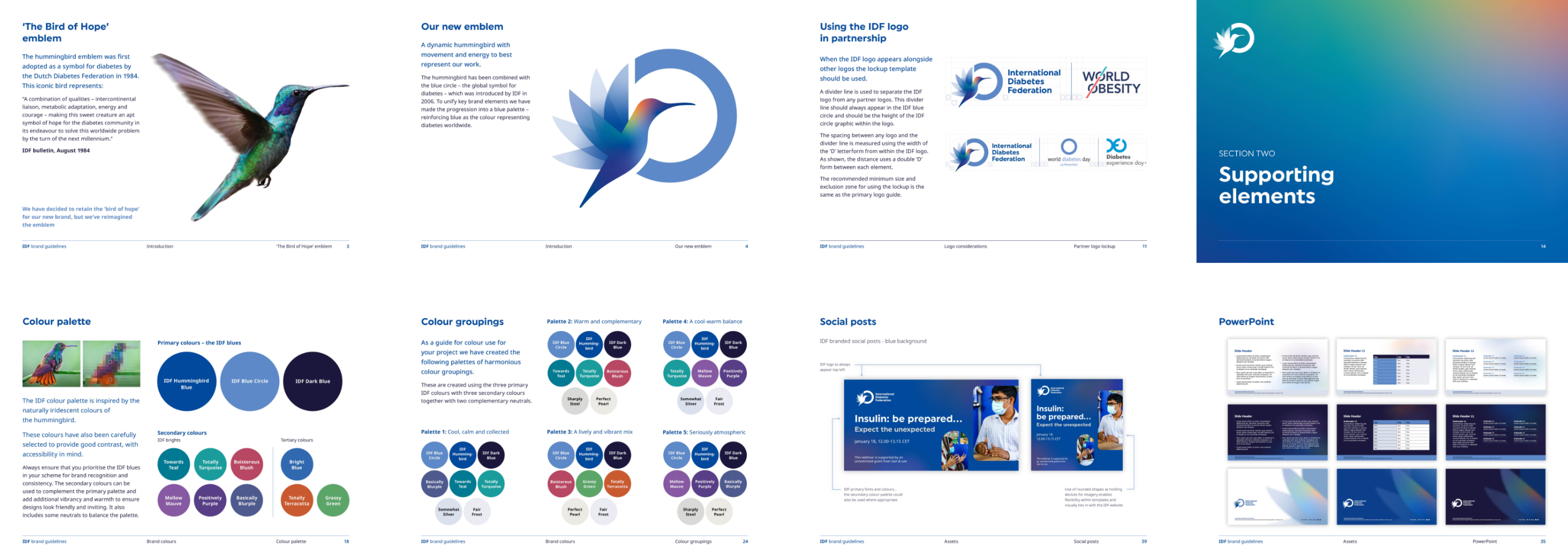
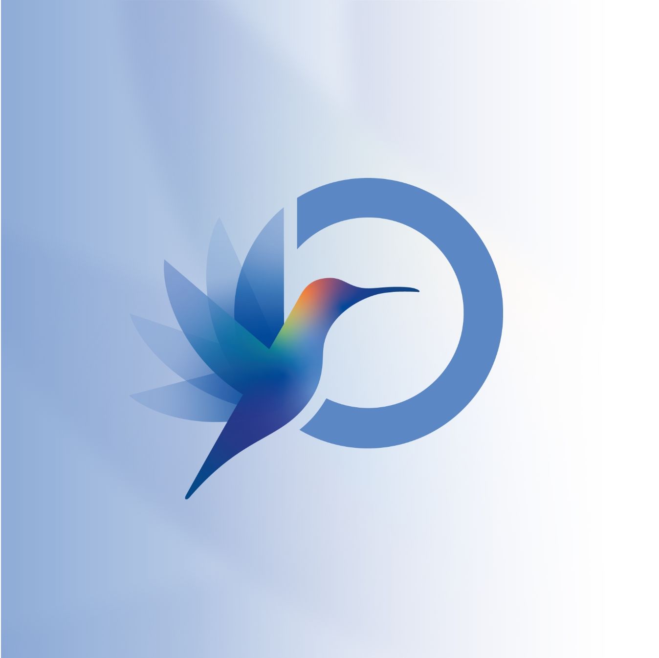
Optima developed a new brand identity for IDF that incorporates the blue circle element with a newly developed hummingbird. Whilst an overall palette of blues forms the basis of the brand’s colour palette, we have evolved a complementary suite of colours inspired by the beauty and iridescence of the hummingbird, which provides warmth and energy to the overall visual identity.
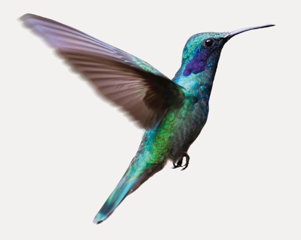

“A combination of qualities – intercontinental liaison, metabolic adaptation, energy and courage – making this sweet creature an apt symbol of hope for the diabetes community in its endeavour to solve this worldwide problem by the turn of the next millennium.”
International Diabetes Federation
We have ensured a versatility in the brand by creating a white version of the logo, allowing for seamless integration across various applications. The resulting brand identity features a harmonious blend of blues, representing solidarity with the diabetes cause, with a complementary energetic colour palette inspired by the hummingbird’s beauty. The design system breathes new life into IDF’s materials, injecting vibrant, positive imagery and a balanced, colourful palette.

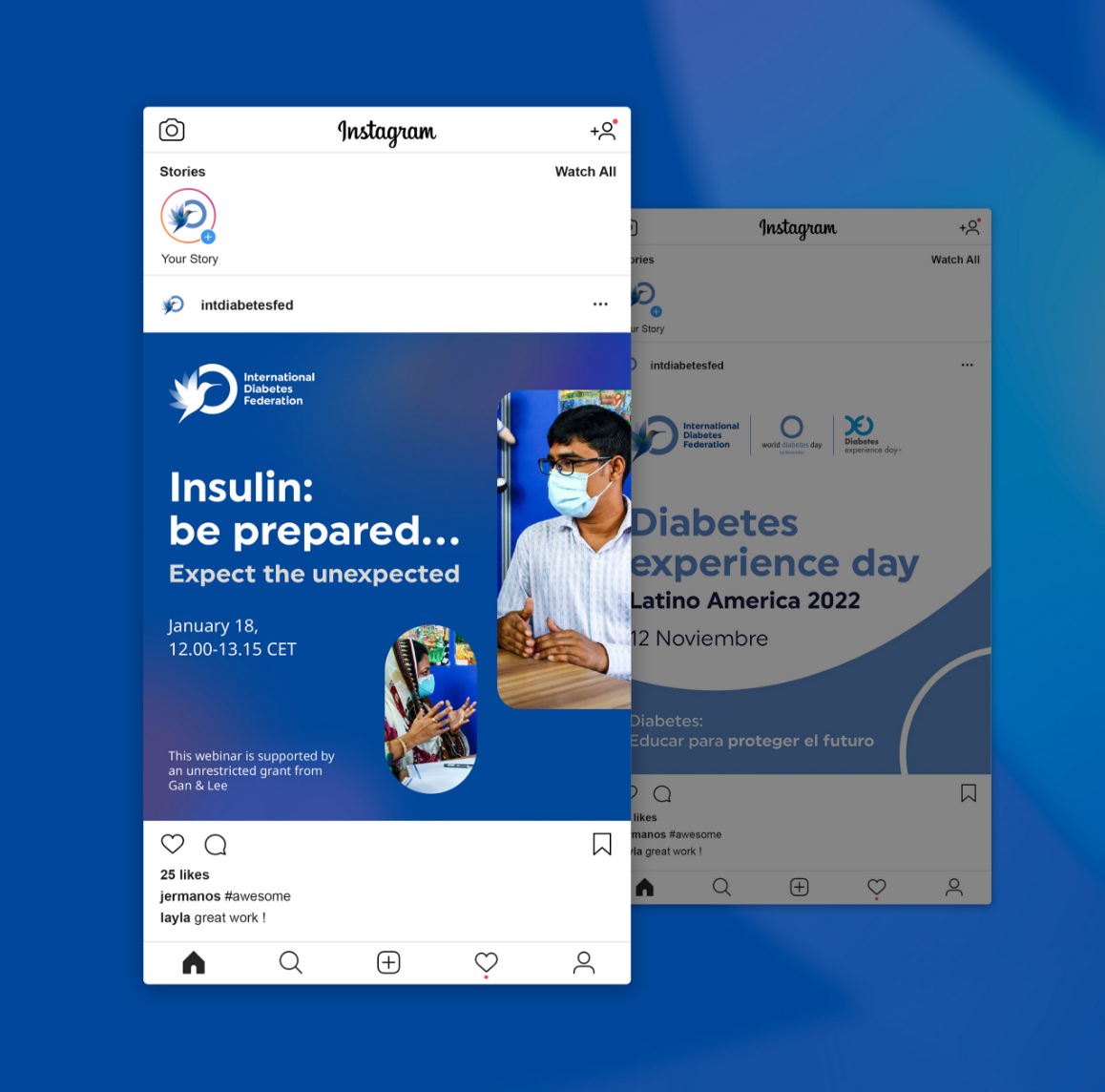
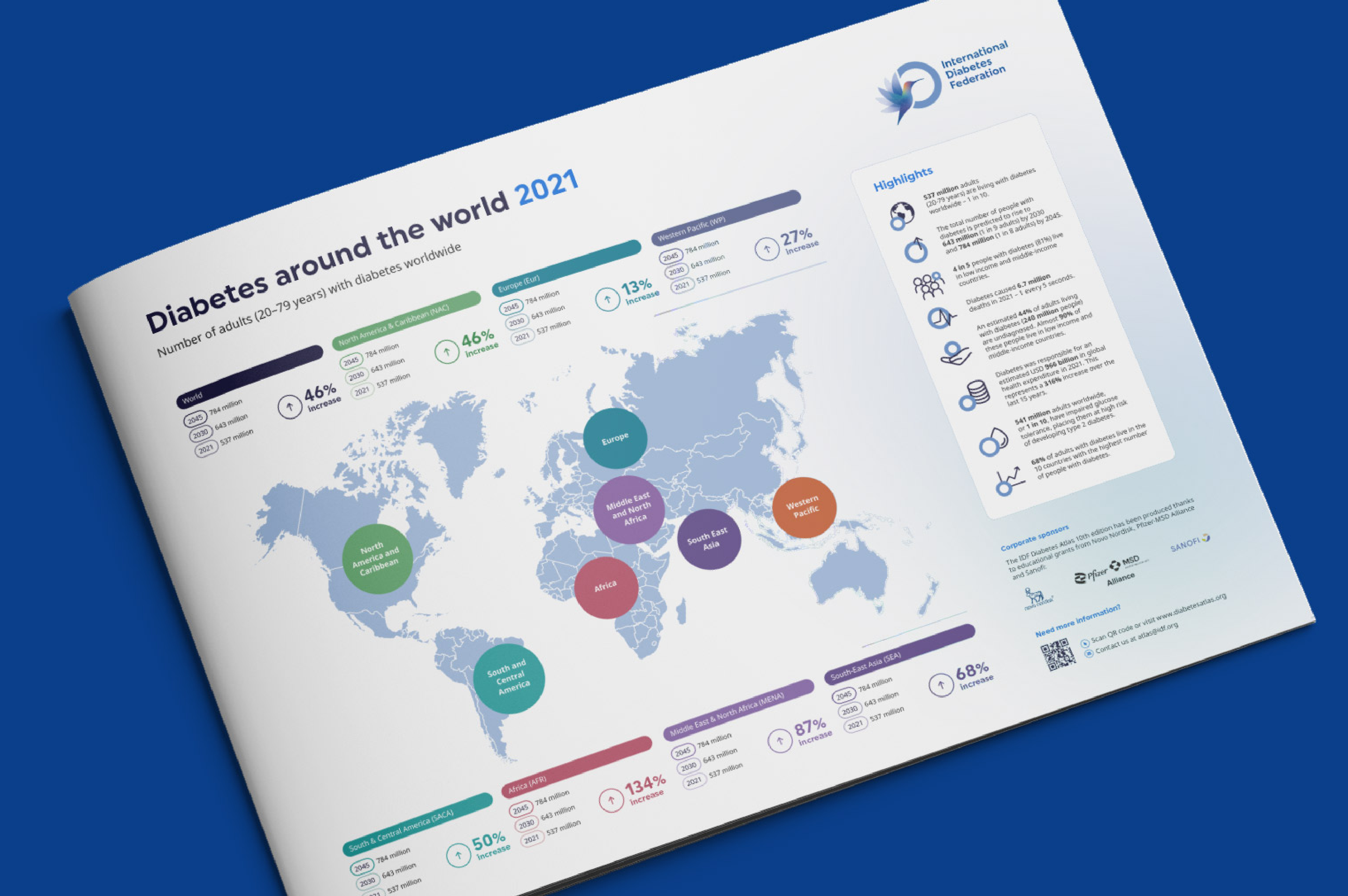
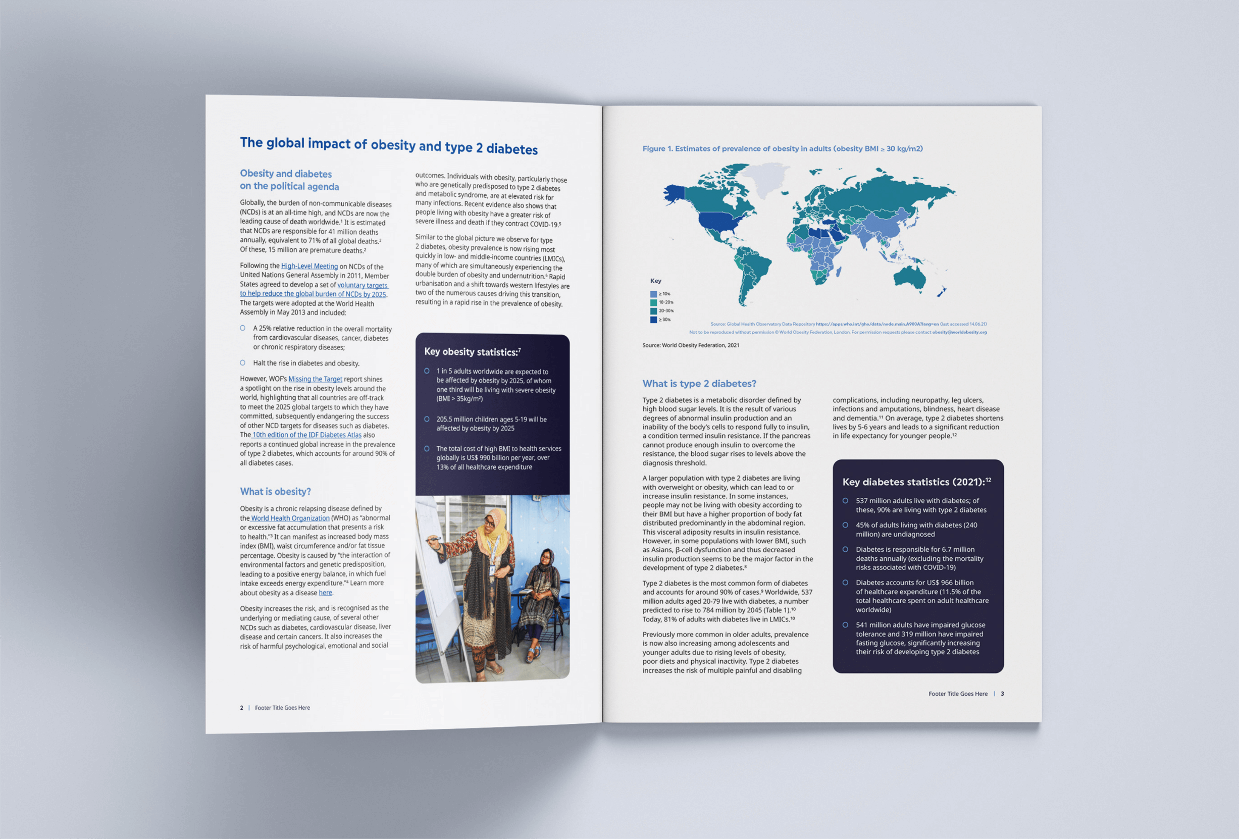
Optima have worked hard to deliver an engaging identity that helps the International Diabetes Federation stand as a leading voice in the diabetes community, united under a powerful message of hope in the fight against diabetes. The rebranding efforts have been well-recieved by global partners and the brand has been effectively implemented across a wide array of online and offline materials, ensuring a cohesive and impactful representation of the International Diabetes Federation’s mission and message.

Latest
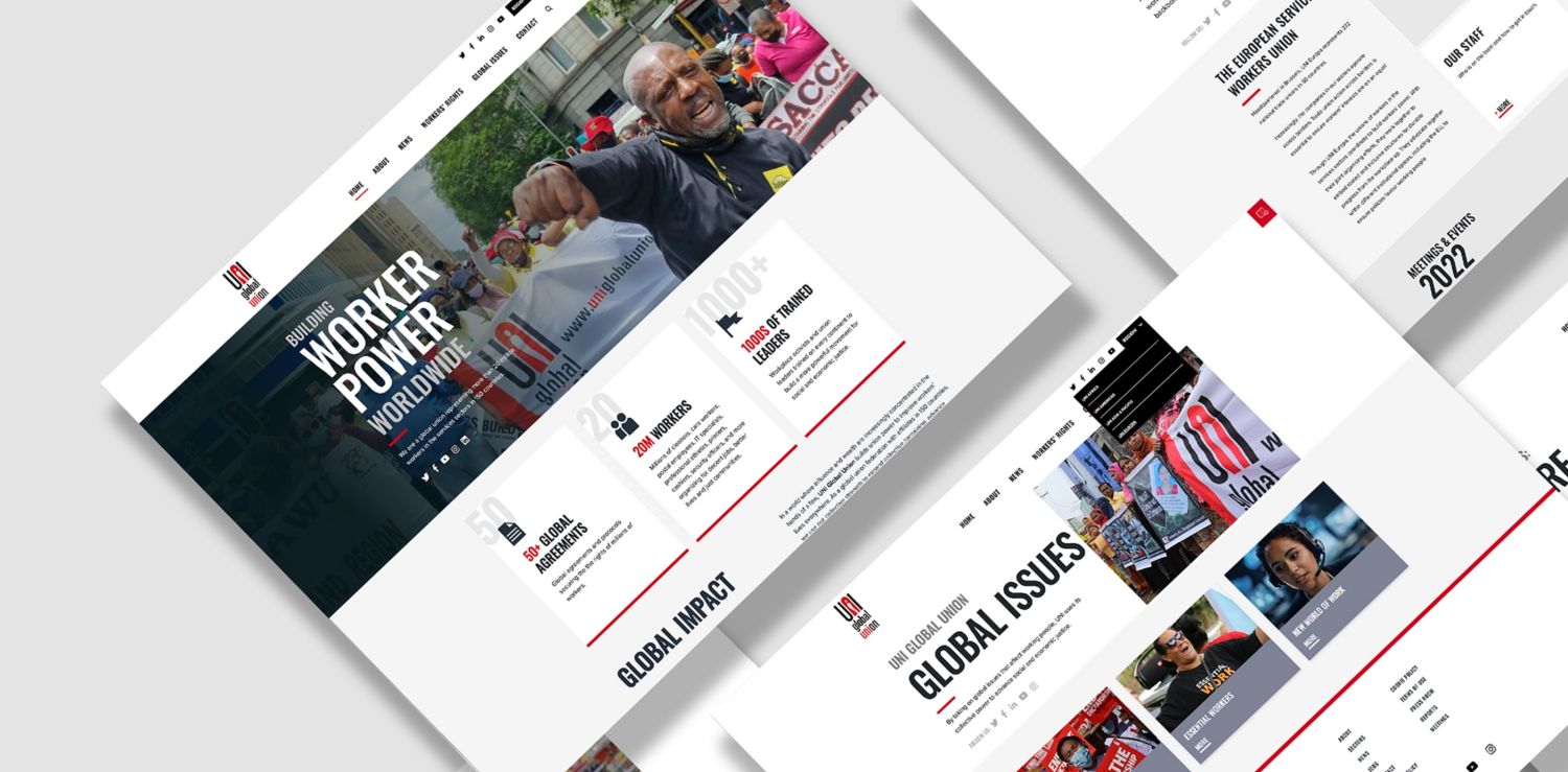
UNI Global Union Website
WebOptima created a new website for UNI Global Union, a major international labor organization representing over 20 million workers around the world.
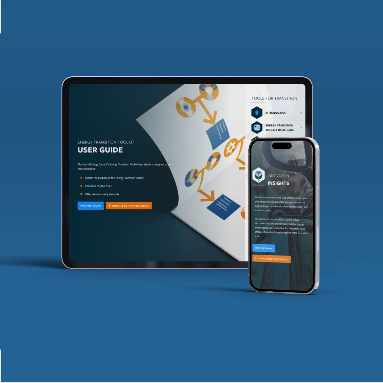
World Energy Council
WebOptima partnered with the World Energy Council to transform their digital presence, creating a dynamic, user-friendly platform that supports WEC’s global initiatives.
